PHYS 5120 - 计算能源材料和电子结构模拟 Lecture
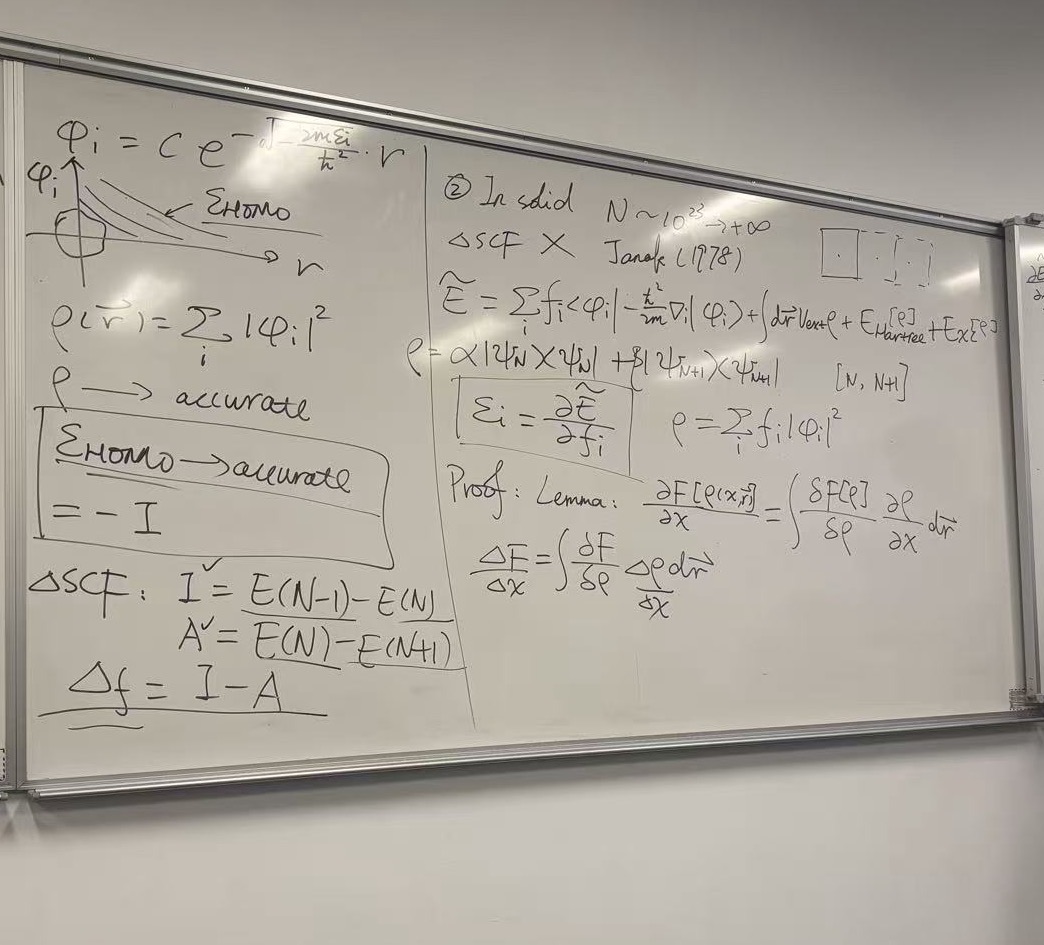
Based on the image provided, these are notes from a physics lecture, specifically focusing on Density Functional Theory (DFT), Ensemble DFT, and the concept of Fractional Occupation.
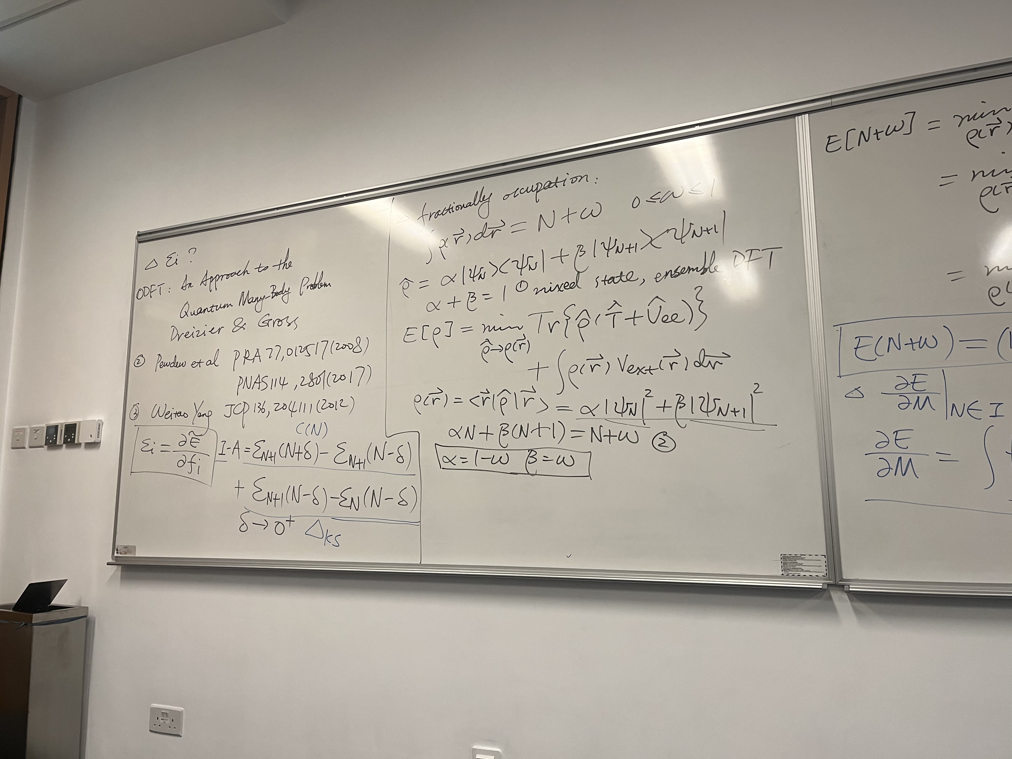
The notes describe how to treat systems with a non-integer number of electrons to derive the “derivative discontinuity” of the energy, which is crucial for calculating band gaps (Ionization Potential minus Electron Affinity).
1. Center Panel: The Core Derivation (Ensemble DFT)
This section derives the energy of a system with a fractional number of electrons (\(N + \omega\)).
Fractional Occupation: The total number of electrons is defined as an integer \(N\) plus a fraction \(\omega\). \[\int \rho(\vec{r}) \, d\vec{r} = N + \omega \quad \text{where } 0 \le \omega \le 1\]
Density Operator (\(\hat{\rho}\)): The system is described as a mixed state (ensemble) of the \(N\)-particle state and the \((N+1)\)-particle state. \[\hat{\rho} = \alpha |\Psi_N\rangle\langle\Psi_N| + \beta |\Psi_{N+1}\rangle\langle\Psi_{N+1}|\]
- Condition 1: Probabilities must sum to 1: \(\alpha + \beta = 1\).
Energy Functional: The variational principle for the energy \(E[\rho]\) involves minimizing the trace of the density operator with the Hamiltonian (\(\hat{T} + \hat{V}_{ee}\)) plus the external potential term. \[E[\rho] = \min_{\hat{\rho} \to \rho(\vec{r})} Tr\left\{\hat{\rho}(\hat{T} + \hat{V}_{ee})\right\} + \int \rho(\vec{r}) V_{ext}(\vec{r}) \, d\vec{r}\]
Electron Density: The density is the weighted sum of the densities of the two states. \[\rho(\vec{r}) = \langle \vec{r} | \hat{\rho} | \vec{r} \rangle = \alpha |\Psi_N|^2 + \beta |\Psi_{N+1}|^2\]
Solving for Coefficients:
- Using the particle number constraint: \(\alpha N + \beta(N+1) = N + \omega\).
- Combining this with \(\alpha + \beta = 1\), the notes conclude: \[\alpha = 1 - \omega\] \[\beta = \omega\]
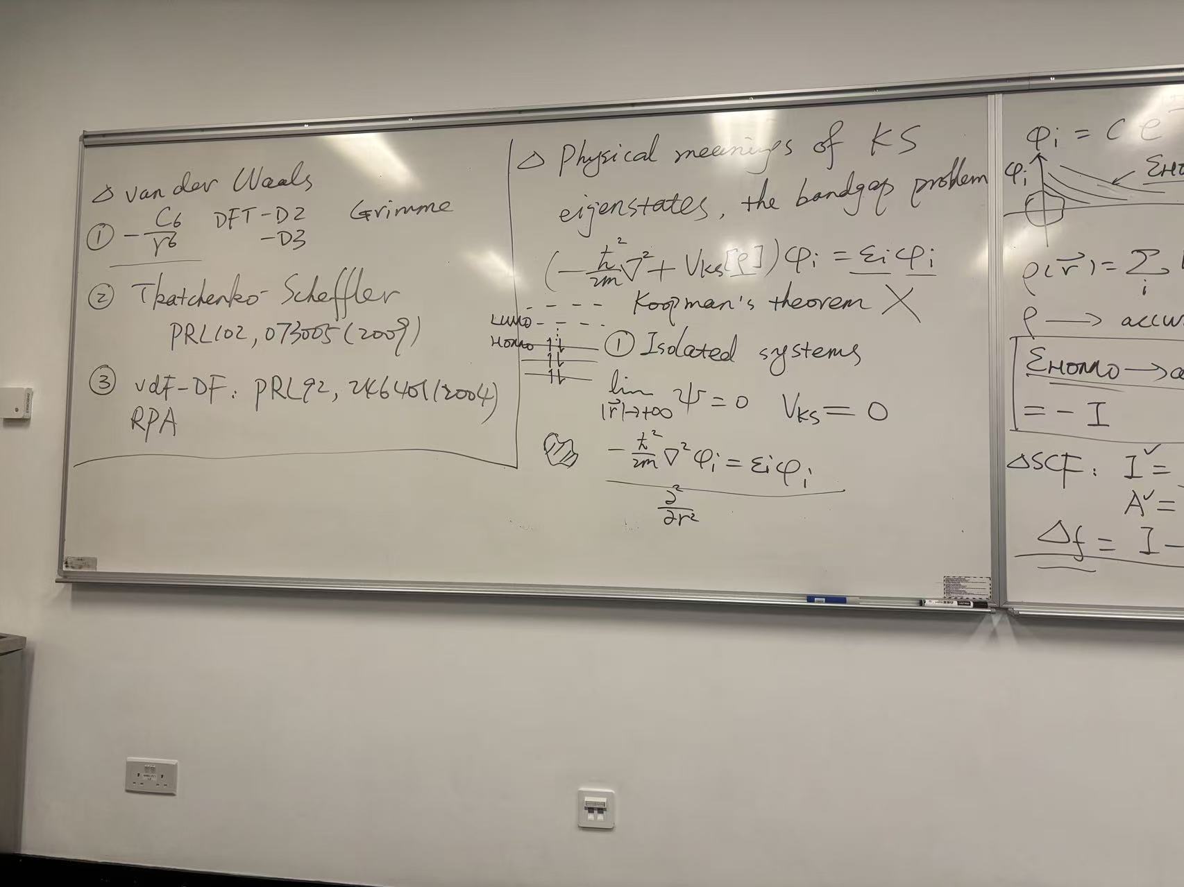
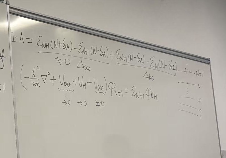
2. Left Panel: Citations & The Gap Question
This section lists key references discussing the “Derivative Discontinuity” and the fundamental gap (\(I - A\)).
- Heading: \(\Delta \mathcal{E}_i ?\) (Referring to the energy gap or derivative discontinuity).
- References:
- Dreizler & Gross: “ODFT: An Approach to the Quantum Many-Body Problem”.
- Perdew et al.: Phys. Rev. A 77, 012517 (2008); PNAS 114, 2801 (2017).
- Weitao Yang: J. Chem. Phys. 136, 204111 (2012).
- Key Equations:
- Chemical potential/Orbital energy: \(\varepsilon_i = \frac{\partial E}{\partial f_i}\)
- The Fundamental Gap (\(I - A\)): \[I - A = \mathcal{E}_{N+1}(N+\delta) - \mathcal{E}_{N}(N-\delta)\] (Note: The handwriting for the specific subscripts here is a bit quick, but it generally describes the difference in energy derivatives as \(\delta \to 0^+\), known as \(\Delta_{KS}\) or the Kohn-Sham gap correction).
3. Right Panel: Linearity Condition
Although partially cut off, this section outlines the famous PPLB (Perdew-Parr-Levy-Balduz) condition, which states that the energy of a fractional system should be linear between integers.
- The Equation: \[E(N+\omega) = (1-\omega)E(N) + \omega E(N+1)\]
- Derivatives: It shows the derivative of Energy (\(E\)) with respect to particle number (\(M\) or \(N\)) is constant between integers but jumps discontinuously at integer points.
Summary of Concepts
- Ensemble DFT: Standard DFT is for pure states. To describe fractional electrons, we use a statistical ensemble.
- Linearity: For the exact density functional, Energy vs. Particle Number is a series of straight line segments connecting integer points.
- The Gap: Because the slope changes at integers, the chemical potential jumps. This jump (derivative discontinuity) is essential for predicting accurate band gaps in solids, which standard approximations (like LDA/GGA) often fail to do.
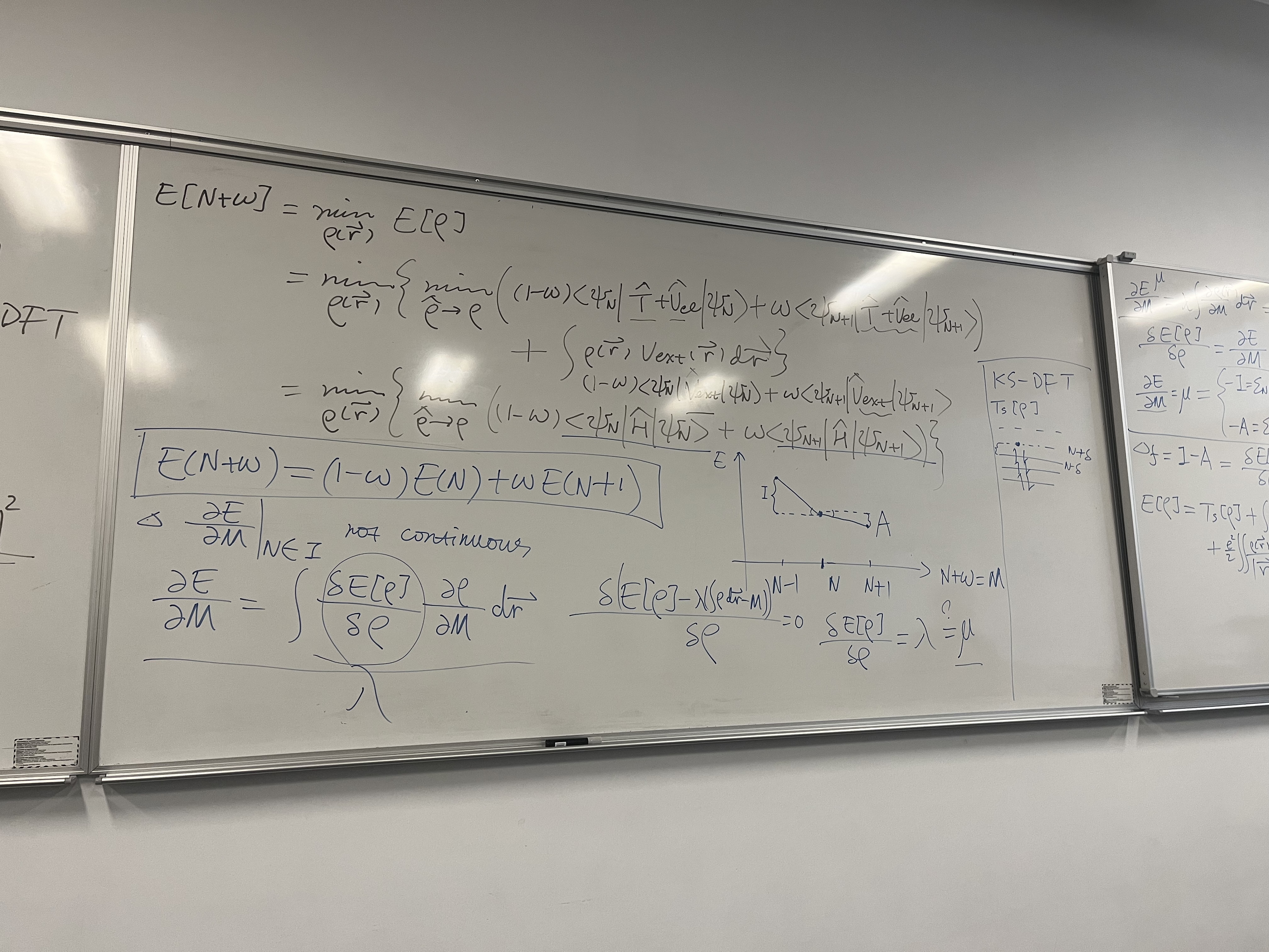
This image is a direct continuation of the previous whiteboard. While the first board set up the Ensemble Density (mixing \(N\) and \(N+1\) states), this board uses that setup to prove the Linearity Condition of the energy and define the Chemical Potential.
1. Derivation of Energy Linearity (Top Section)
The board derives the famous result that for the exact functional, the energy varies linearly with fractional electron number.
- The Variational Principle: \[E[N+\omega] = \min_{\rho(\vec{r})} E[\rho]\]
- Expanding the Ensemble: Using the result from the previous board where \(\alpha = (1-\omega)\) and \(\beta = \omega\): \[= \min_{\rho} \left\{ (1-\omega)\langle\Psi_N|\hat{T}+\hat{V}_{ee}|\Psi_N\rangle + \omega\langle\Psi_{N+1}|\hat{T}+\hat{V}_{ee}|\Psi_{N+1}\rangle + \int \rho V_{ext} d\vec{r} \right\}\]
- Combining Terms: Since \(\hat{H} = \hat{T} + \hat{V}_{ee} + \hat{V}_{ext}\), the equation collapses into a weighted average of the energies of the integer states: \[= (1-\omega)\langle\Psi_N|\hat{H}|\Psi_N\rangle + \omega\langle\Psi_{N+1}|\hat{H}|\Psi_{N+1}\rangle\]
- The Boxed Result (The PPLB Condition): \[E(N+\omega) = (1-\omega)E(N) + \omega E(N+1)\] Significance: This proves that the ground state energy is a series of straight line segments connecting integer electron numbers. This is a fundamental constraint known as the Perdew-Parr-Levy-Balduz (PPLB) condition.
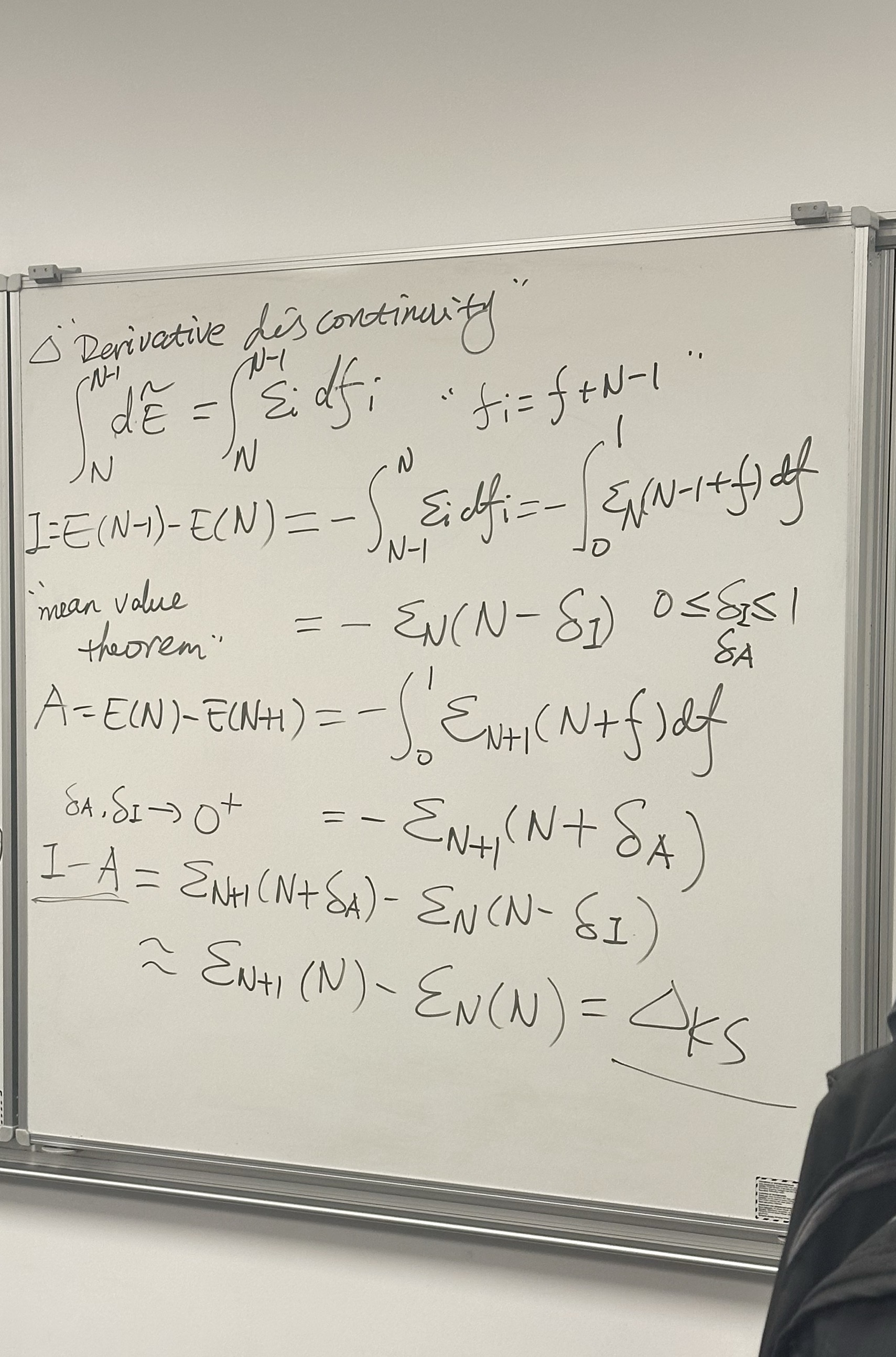
2. The Derivative Discontinuity (Middle & Graph)
The lecturer illustrates the consequence of the linearity derived above.
- The Graph:
- The graph plots Energy (\(E\)) vs Electron Number (\(M\)).
- The line connects \(E(N-1)\), \(E(N)\), and \(E(N+1)\).
- Because the slope changes at \(N\), the derivative is discontinuous.
- Text Notation: \[\left.
\frac{\partial E}{\partial M} \right|_{N \in I} \text{not
continuous}\]
- Slope to the left (\(N \to N-1\)): Related to Ionization Potential (\(I\)).
- Slope to the right (\(N \to N+1\)): Related to Electron Affinity (\(A\)).
3. Chemical Potential and Variational Calculus (Bottom Section)
This section formally defines the chemical potential \(\mu\) using functional derivatives.
- Chain Rule for Total Derivative: \[\frac{\partial E}{\partial M} = \int \frac{\delta E[\rho]}{\delta \rho} \frac{\partial \rho}{\partial M} d\vec{r}\]
- Lagrange Multiplier Method: To minimize energy while keeping particle number \(M\) fixed, they introduce a Lagrange multiplier \(\lambda\): \[\frac{\delta \{E[\rho] - \lambda (\int \rho d\vec{r} - M) \}}{\delta \rho} = 0\]
- The Result: \[\frac{\delta E[\rho]}{\delta \rho} = \lambda = \mu\] This states that the functional derivative of the energy with respect to density is the chemical potential (\(\mu\)).
4. Right Panel (Partially Visible)
This side connects the formal theory to Kohn-Sham (KS) DFT.
- Diagram: Shows energy levels with occupied (solid lines) and unoccupied (dashed lines) orbitals.
- Equation: \(\Delta = I - A\). This defines the fundamental gap (band gap).
- Connection: In exact DFT, the chemical potential \(\mu\) jumps by an integer constant (the derivative discontinuity, \(\Delta_{xc}\)) when passing through an integer electron number. This “jump” is what’s missing in approximate functionals (like LDA/GGA), causing them to underestimate band gaps.
Summary of the Lecture: The professor is proving that if you treat a system with a fractional number of electrons correctly (as a statistical ensemble), the energy must result in straight lines between integers. Because of these straight lines, the slope (chemical potential) jumps at integers. This “Derivative Discontinuity” is the physical origin of the band gap in Density Functional Theory.
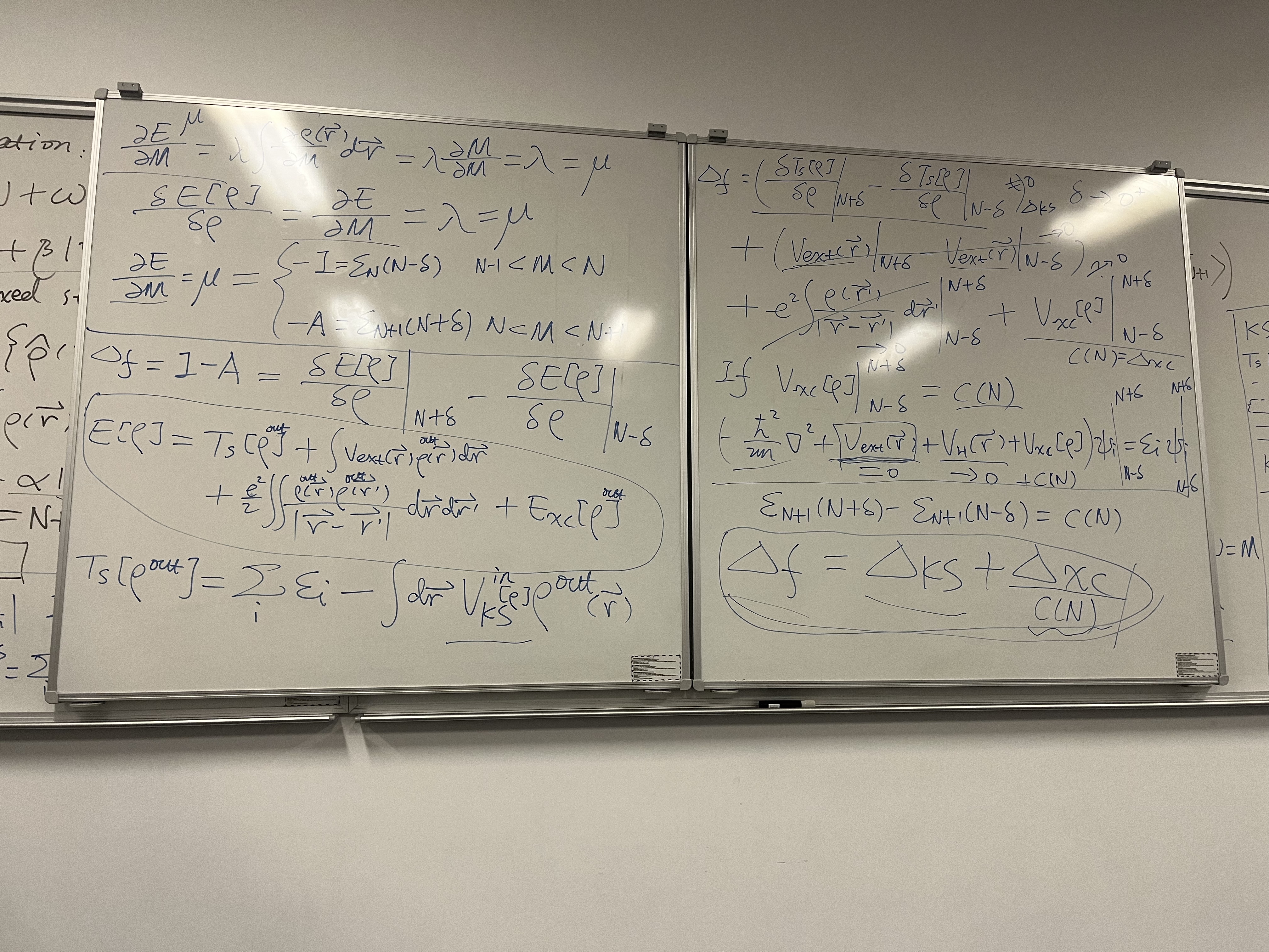
This third image serves as the conclusion of the derivation started in the previous two images. It connects the Fundamental Gap (experimental band gap) to the Kohn-Sham Gap (calculated band gap).
This is the mathematical proof of the “Band Gap Problem” in Density Functional Theory (DFT).
Here is the breakdown of the equations and logic on the board:
1. Left Panel: Defining the Gap via Chemical Potential
The board starts by defining the chemical potential (\(\mu\)) essentially as the slope of the energy curve derived in the previous images.
Chemical Potential Limits: Depending on whether we are removing or adding an electron (approaching integer \(N\) from the left or right), the chemical potential \(\mu\) differs:
- Electron Removal (\(M < N\)): \(\mu = -I\) (Ionization Potential).
- Electron Addition (\(M > N\)): \(\mu = -A\) (Electron Affinity).
The Fundamental Gap (\(\Delta_f\)): The fundamental gap is defined as the difference between the Ionization Potential and Electron Affinity: \[\Delta_f = I - A = \left. \frac{\delta E[\rho]}{\delta \rho} \right|_{N+\delta} - \left. \frac{\delta E[\rho]}{\delta \rho} \right|_{N-\delta}\] This represents the “jump” in the derivative of the total energy as you pass through the integer electron number \(N\).
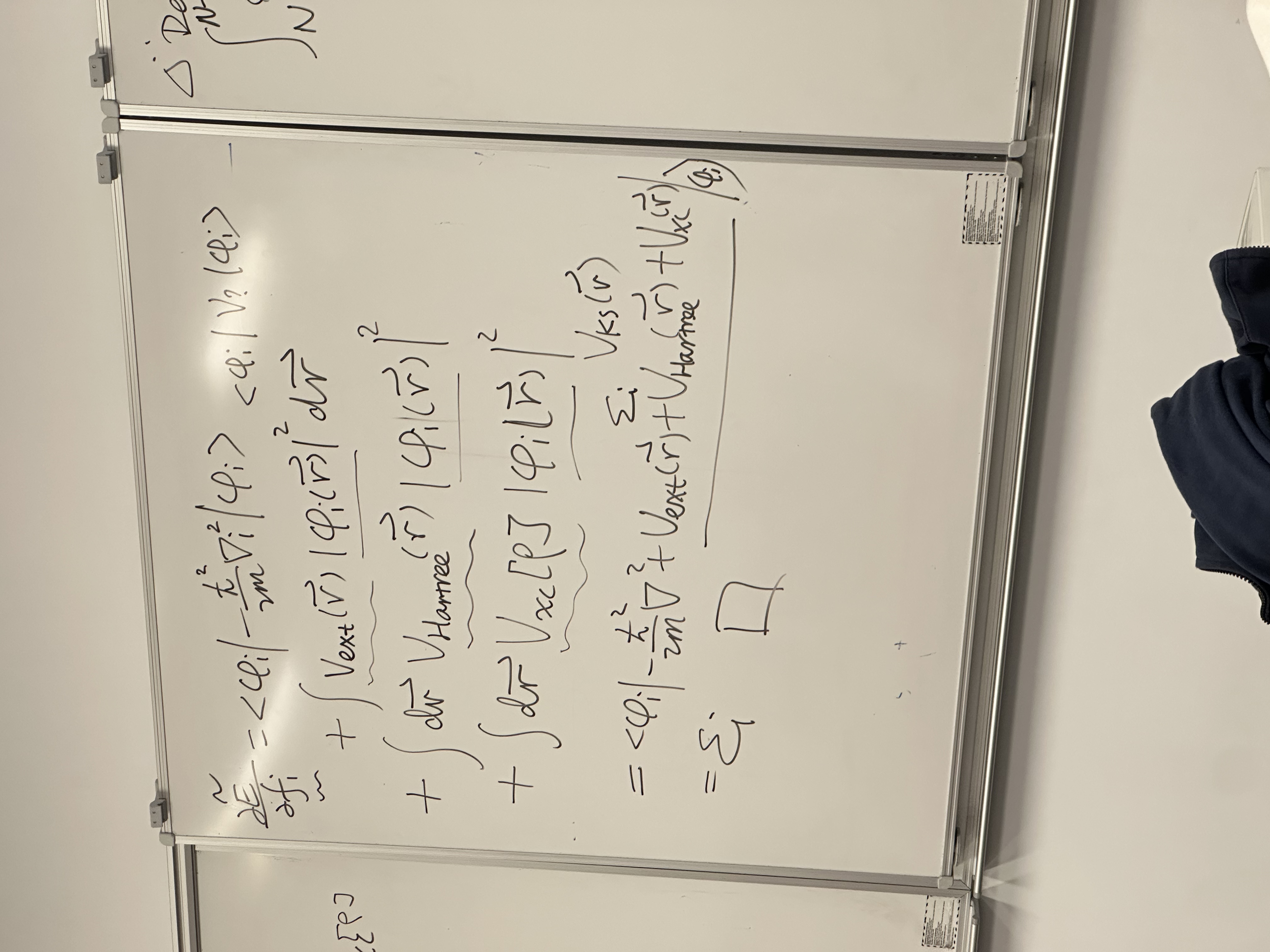
Total Energy Expansion: To find what causes this jump, the board writes out the standard Kohn-Sham total energy functional: \[E[\rho] = T_s[\rho] + \int V_{ext}\rho \, d\vec{r} + \frac{e^2}{2} \iint \frac{\rho \rho'}{|\vec{r}-\vec{r}'|} \, d\vec{r}d\vec{r}' + E_{xc}[\rho]\]
2. Right Panel: The Decomposition of the Gap
The goal here is to take the derivative of each term in the energy equation above and see which ones “jump” at integer \(N\).
\[\Delta_f = \left( \text{Difference in derivatives at } N+\delta \text{ and } N-\delta \right)\]
The board analyzes the terms one by one:
- External Potential (\(V_{ext}\)): Continuous. No jump. (\(\rightarrow 0\))
- Hartree/Coulomb Term (\(V_H\)): Continuous. No jump. (\(\rightarrow 0\))
- Kinetic Energy Term (\(T_s\)): The derivative of kinetic
energy with respect to density yields the Kohn-Sham eigenvalues (\(\varepsilon\)).
- This difference is the Kohn-Sham Gap: \(\Delta_{KS} = \varepsilon_{LUMO} - \varepsilon_{HOMO}\).
- Exchange-Correlation Term (\(V_{xc}\)):
- \(\left. V_{xc} \right|_{N+\delta} - \left. V_{xc} \right|_{N-\delta} = C(N)\)
- This term does not cancel. It is a constant shift in the potential known as the Derivative Discontinuity.
3. The Final Result (Boxed Equation)
At the bottom right, the lecture arrives at the critical conclusion:
\[\Delta_f = \Delta_{KS} + \Delta_{xc}\]
(Note: The board also labels \(\Delta_{xc}\) as \(C(N)\)).
What this means physically: * \(\Delta_f\): The real, physical band gap (measured experimentally as \(I - A\)). * \(\Delta_{KS}\): The band gap you calculate using the eigenvalues of the Kohn-Sham equations (\(\varepsilon_{N+1} - \varepsilon_N\)). * \(\Delta_{xc}\): The Derivative Discontinuity.
The Takeaway: The calculated Kohn-Sham gap (\(\Delta_{KS}\)) is NOT equal to the true fundamental gap (\(\Delta_f\)). It is missing a rigid shift constant, \(\Delta_{xc}\).
This explains why standard DFT (LDA/GGA) severely underestimates band gaps in semiconductors. Standard functionals “smooth out” the energy curve, effectively setting \(\Delta_{xc} \approx 0\), leaving you with only the \(\Delta_{KS}\), which is too small.
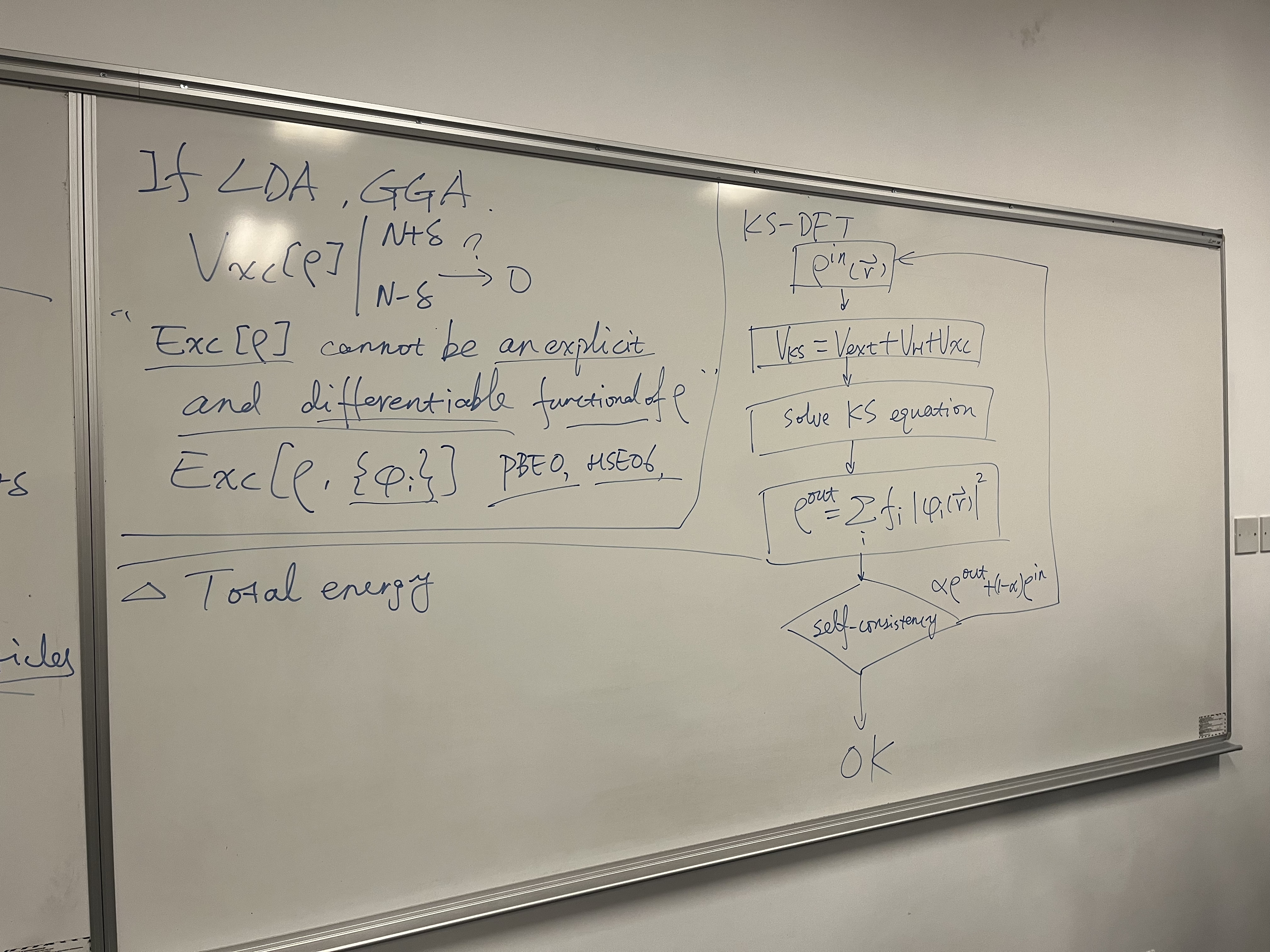
This fourth and final image connects the theoretical derivation from the previous boards to the practical reality of computational chemistry software. It explains why standard approximations fail and illustrates the algorithm used to solve these equations.
Here is the breakdown:
1. Left Panel: Why LDA & GGA Fail the Gap Test
This section explains why the “Band Gap Problem” exists in standard DFT calculations.
- The Failure of LDA/GGA: The notes state: \[\text{If LDA, GGA: } \quad V_{xc}[\rho]
\bigg|_{N-\delta}^{N+\delta} \to 0\]
- Meaning: In standard approximations like the Local Density Approximation (LDA) or Generalized Gradient Approximation (GGA), the exchange-correlation potential is a smooth, continuous function. It does not jump when the electron number crosses an integer.
- Result: Because the “jump” (derivative discontinuity) is zero, the predicted band gap is just the Kohn-Sham gap (\(\Delta_{KS}\)), which we proved in the previous board is significantly smaller than the true fundamental gap. This is why standard DFT underestimates band gaps.
- The Theoretical Reason: > “\(E_{xc}[\rho]\) cannot be an explicit and
differentiable functional of \(\rho\).”
- For the “jump” to exist, the exact functional must have a “kink” at integer particle numbers. Smooth mathematical functions (like those used in LDA/GGA) cannot reproduce this kink.
- The Solution (Hybrid Functionals): The board lists:
> “\(E_{xc}[\rho, \{\phi_i\}]\)
PBE0, HSE06”
- To fix the problem, we use functionals that depend on the orbitals (\(\phi_i\)) rather than just the density.
- PBE0 & HSE06: These are “Hybrid Functionals” that mix in a portion of Exact Exchange (Hartree-Fock exchange). This orbital dependence reintroduces some of the derivative discontinuity, leading to much more accurate band gap predictions.
2. Right Panel: The Kohn-Sham SCF Loop
This flowchart illustrates the Self-Consistent Field (SCF) algorithm, which is the “engine” inside software like VASP, Gaussian, or Quantum ESPRESSO.
The Steps:
- Initial Guess (\(\rho^{in}\)): The computer guesses an initial electron density \(\rho^{in}(\vec{r})\) (often a superposition of atomic densities).
- Construct Hamiltonian (\(V_{KS}\)): Calculate the effective potential based on that guess: \[V_{KS} = V_{ext} + V_H[\rho^{in}] + V_{xc}[\rho^{in}]\]
- Solve KS Equations: Solve the Schrödinger-like equation: \[\left( -\frac{1}{2}\nabla^2 + V_{KS} \right) \phi_i = \varepsilon_i \phi_i\]
- Calculate New Density (\(\rho^{out}\)): Construct a new density from the orbitals you just found: \[\rho^{out} = \sum_i f_i |\phi_i(\vec{r})|^2\]
- Check Convergence (Diamond Shape): Compare the new
density (\(\rho^{out}\)) with the old
one (\(\rho^{in}\)).
- Is it Self-Consistent? (Is the difference roughly
0?)
- NO: Update the guess by mixing the old and new densities to ensure stability (\(\alpha \rho^{out} + (1-\alpha)\rho^{in}\)) and go back to Step 2.
- YES (OK): The calculation is finished. You have found the ground state.
- Is it Self-Consistent? (Is the difference roughly
0?)
Summary of the Whole Series
These four whiteboards tell a complete story of advanced DFT theory:
- Board 1 & 2 (Ensemble Theory): We must treat fractional electron systems as statistical ensembles. This proves that Energy vs. Particle Number must be a series of straight lines (Linearity).
- Board 2 & 3 (The Gap): Because of those straight lines, the slope (Chemical Potential) “jumps” at integers. This jump (\(\Delta_{xc}\)) is a crucial part of the real band gap.
- Board 3 & 4 (The Problem & Solution): Standard DFT (LDA/GGA) misses this jump because it uses smooth functions, leading to wrong band gaps. To fix this, we use Hybrid Functionals (like HSE06) which depend on orbitals, and we solve them using the iterative SCF loop shown on the last board.